Category Archives: Uncategorized

Logo Trend: Variations #2: Channel Four

 One well established example of versatile identity is that of Channel 4 – and its many sub-channels – and their really striking, diverse yet easily recognisable idents. Admittedly, it could be argued that the logos do not change – they are the simple shapes that the idents use in interesting ways, but either way it really gives the channel some life, and maybe questions what it is that the channels are hoping to promote; themselves, or the programs, interests and culture they present.

You can check out a vast collection of Channel four’s logos and idents here.

Oh, and however much I’ve always love More 4’s logo and idents, this is rather pretty:

MvsM / More4 On-screen GFX from ManvsMachine on Vimeo.

Logo Trends: Variations (#1) – Wolff Olins

After a logo design I developed a month or two ago, with emphasis on promoting diversity, I’ve noticed more and more “logos”showing multiple variations, and thus a more versatile application of branding and corporate identity. And, arguably, a more creative feel. I feel like corporate identity has always previously felt a little solid, conventional – and yet in need of constant reinvention to keep fresh. The evolution of NBC and Pepsi stand out.

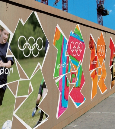
If I were to chose a designer/agency that best demonstrated the concept of variation within corporate identity, I’d have to say Wolff Olins do so pretty well. Regardless of how controversial and questionably conceptual the logo design for London 2012 is, in my opinion it showcases the use of variations in logo applications perfectly. The logo image is unconventional, striking and iconic (whether or not it could be interpreted as Lisa and Bart Simpson in an unflattering position) – and the application of various bold colours and images within the iconic shape promotes the modern, energetic and diverse atmosphere the games hope to capture. Just considering how to analyse it for this post has, actually, diminished my uncertainty as to its aesthetic awkwardness.

I’ve posted about one of these before, but Wolff Olins have also branded two art galleries which are incredibly relevant here – the Asian Art Museum and the New Museum – the logos of which have variations that use either image or text to promote the numerous styles and works that the galleries present – vital to capture the diversity within art.

“Trio Carmel” Branding – hellorex

Absolutely love this logo design for Trio Carmel Olive Oil – the concept is clearly communicated and refreshingly simple, creating an iconic logo in some wonderful colours too. This design is by Alexander Rexworthy – (hellorex) You can check out his DesignCrowd portfolio here: designers.designcrowd.com/designer/418/hellorex, or his website: hellorex.com/3176/home

John Stezaker

Just come across the fantastic collage artist John Stezaker, after feeling the need to research the cover of the book I was reading on Appropriation. His understanding and visually intellectual use of the form of collage is really evident and striking – and the quite minimal (I hate how often that word is used, but it’s definitely relevant) appraoch to collage is a really nice contrast to what the form generally suggests.

“John Stezaker: My mother has always been horrified at how my work emerged out of childhood vandalism. I was into it from the beginning, seemingly. I cut up and defaced books, and was regarded as very naughty for doing it. I do still feel that guilt, there is something very peculiar about taking a scalpel which was invented for surgical purposes and cutting across the emulsion of a photograph. I don’t know why I felt it was necessary. It shocks me sometimes how violent my early work was. But you can only get a feeling of the inviolable purity and sanctity of the emulsion of a photograph by violating it.” Interview here: http://www.bjp-online.com/british-journal-of-photography/interview/1940374/john-stezaker-vandal-thief.

Helveticards

Fantastic typographic playing card designs by Ryan Myers at UD+M, striking and minimal, and disregarding the conventional mirrored aesthetic of playing cards. Josef Müller-Brockmann loves them too: http://josef-muller-brockmann.net/2010/06/helveticards/

Wong Kar-Wai

A tribute to Wong Kar-Wai’s film-making. Including “Chungking Express” – possibly my all-time favourite film.

“Since 1989, Wong Kar-wai has directed seven feature films and won numerous awards, including the best director’s prize at the 1997 Cannes Film Festival for Happy Together.

Wong Kar-wai’s latest film is In the Mood for Love (花樣年華, lit. “Flower Like Years”). He is currently completing the science fiction film 2046 for release in 2004.

In 2001 Wong Kar-wai directed the short-film The Hire: The Follow as part of the BMW films initiative.

Feature-Films Filmography
2046 (2004) (filming)
In the Mood for Love (2000)
Happy Together (1997)
Fallen Angels (1995)
Ashes of Time (1994)
Chungking Express (1994)
Days of Being Wild (1990)
As Tears Go by (1988)

Awards
Best Director, 1997 Cannes Film Festival
Best Foreign Film, 2001 César Award
Screen International Award, 2000 European Film Awards”

– (http://www.biographybase.com/biography/Kar-wai_Wong.html)